
The Nags
The Client
The Nags are an independent punk band located in Seattle, WA who had recently finished recording and mastering their self-titled debut album.
The Project
I was referred to this project by a mutual contact with the band. They needed help getting copies of their debut album manufactured in-time for sale at upcoming live shows. The format was a cassette tape, and when I was looped-in on this project the deadline for the printed materials was only two days away. This was my first time designing for a tape. Having experience working with online advertising, I was all too familiar with the nature of tight turnaround times. As such I'm used to working quickly and using my time efficiently.
What I Did
- Layout
- Visual design
- Typography & color
- Preparing design files for printing
How it Went
Despite such time constraints, I'm pleased to say that this project went smoothly. The deadline was very close when I met with a member of the band, but they already had a solid direction for where they wanted to go with the design. What they needed was someone with the skills to pull everything together and on-time.
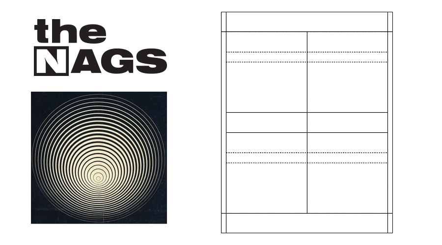
For this project, I wasn't starting completely from scratch. Though all I had to work with was a logo, a piece of key art, and some unfamiliar templates.
In our design meeting, I got the files and templates I needed for the J-card insert and the tape label. The band already had a logo and a piece of artwork to use for the cover. They also showed me an online image of the tapes that were already ordered—a glass bottle-esque transparent green. There was also an example of a font they wanted to use for the text and track list. While it may have seemed sparse, I had everything I needed to get to work.

Mockup of the J-card insert for the cassette tape. I placed the artwork in an asymmetric position, letting the design bleed over the edge of the cover. This added visual interest and helped frame the text on the spine of the card.
Going in I didn't even know that the insert inside the tape was called a J-card, let alone used the template before. By using another cassette a visual aid, I had no issues identifying the panels on the template for printing. I saw it was a 4-up layout and which way the images had to be oriented. First I created the above mockup of the design to see how everything would look. Also to check the size and placement of text, and sort out the colors.
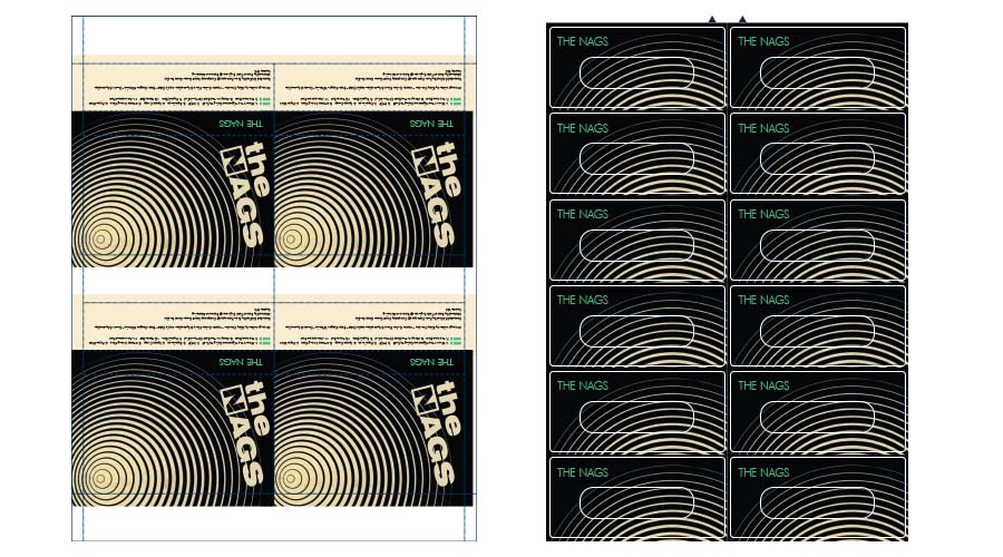
The completed templates for the J-card and labels ready for printing (outlines added here for illustrative purposes). While I made the original J-card mockup in Photoshop, I completed these sheets using Adobe InDesign.
The band was very happy with the layout and mockup so things came together in short order. A necessity given the time constraints. I was able to match the green color from the tape and font from their sample completely from memory.
Once approved, I made sure everything was ready for printing. All images were laid out and oriented correctly, including proper bleeds and marks, and provided in the correct format and compression. Even though this was my first time working on a tape, no revisions were needed from the printer. It's always nice to get something right the first time.
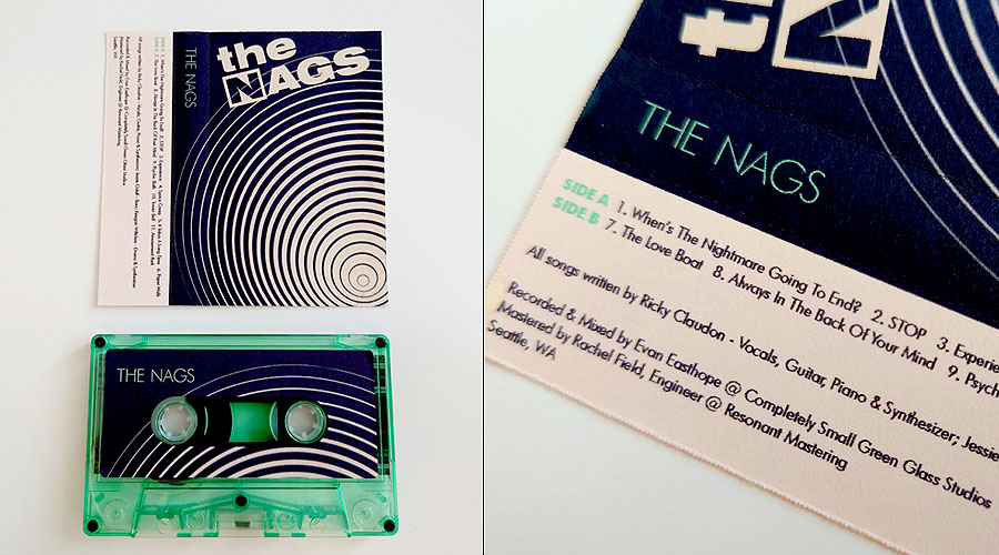
The completed tape and J-card.
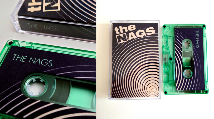
The completed tape and J-card. I designed the tape label to create an echo of the J-card design.
My Takeaways
This was a relatively quick project, given the short deadline, but no project is too small to not be a learning experience. This turned out to be a test of my skills. Both at navigating the unfamiliar and diving in on something I had never done before. It was a test of memory and also a test of speed. Getting the design and files right the first time for the printer was great. It let me know that my skills for working with print are on the right track.